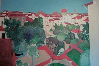
This is the painting as it was when I last left it. As you can see I did some work on the foliage center right and the Eucalyptus tree on the left. I also darkened part of the pathways to the right. (I have darkened all the paths now) As I had said I repainted the sky area, It is a solid blue at the moment though, awaiting some life from the 3rd working. I also lay the same blue into the water of the pond.
Today I managed quite a lot of work on the painting, a solid layer on most of the remaining buildings, white tinted with either blues, yellows or peach depending on the light level I wanted.
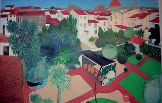
After painting the white wall areas I was led into the roof of the Orangerie which had been blocked in too short, so I repainted that, there is still an edge showing in the photo, so it will need another layer yet. I also worked on the wall of the Orangerie and whitened the facia under the roof.
I continued on with the same area, painting the pots... which led me onto the others dotted around the garden... and then I lay another coat on the interior of the Orangerie, this then will allow me to paint the Orange Trees in the pots
next week. I then brightened the greens on the lawns, darkened the remaining pathways...unfinished on Tuesday... and I altered the gravel areas, these still need a lot of adjusting though, but they are at least 'clean' now after the areas that were overpainted have been obliterated....
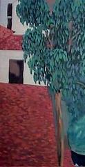
...finally I did some more work on the rooftop patio bottom left, and a little on the path beside it. I also did the same on the roof above the patio.
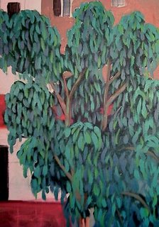
Here are two details, The 1st is of the Eucalyptus Tree, the 2nd is the combination of the tree with the patio an roof work. This is interesting in that I have used the same strokes or marks for both the leaf effect as for the tiles but at totally different angles...ie. vertical & horizontal, coupled with the strict regimented marks of the flat surfaces and the wavy rounded marks that roll out and down from the tree top. This ties the two a
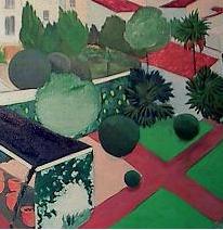 reas together, and yet, clearly delineates the living from the inanimate. This contrasts with the differences in the treatment of the foliage on the right, the grass and the topiary speres are painted solidly, while the palms are loose and feathery. These solid spheres add a focal point in the garden while enhancing the other foliage painting. I am starting to create a nice feeling ofcontrast and contradiction in the work. This will add to the interest.
I am looking forward to getting back to it tommorrow.
No comments:
Post a Comment